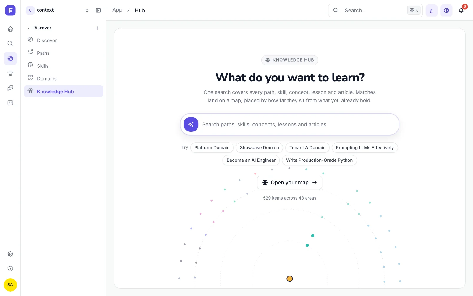
Three releases on 8 and 9 September. The main one adds the Knowledge Hub at /app/hub.
One search, drawn as a map
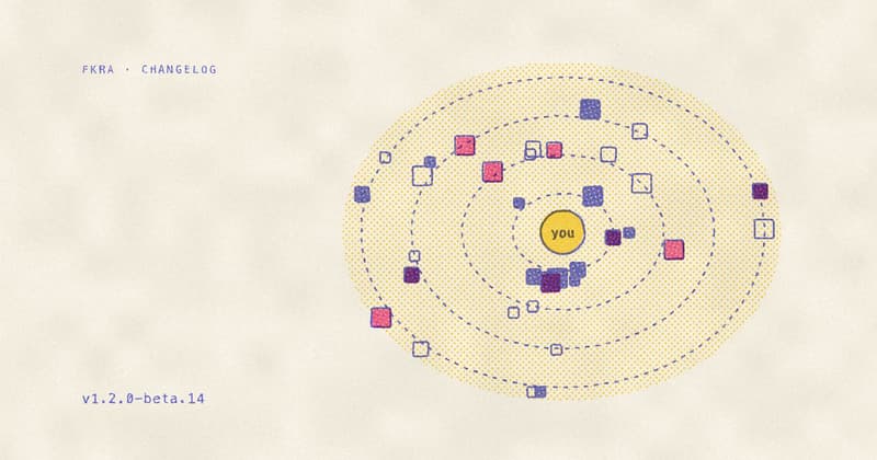
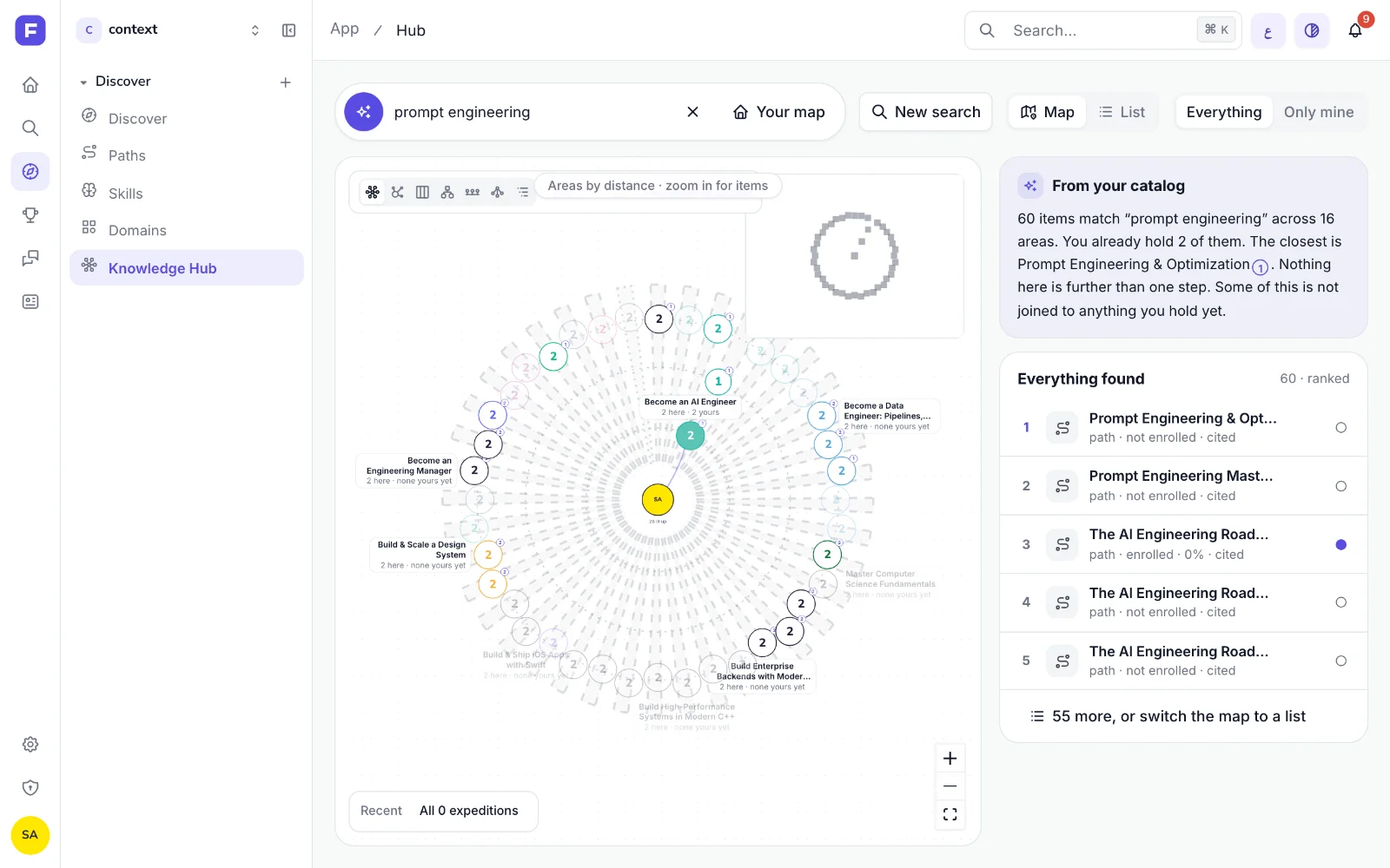
One search box covers paths, skills, concepts, modules, micro-lessons, wiki pages and Journal articles. The results sit on a map with you at the centre. The angle is the subject area, the distance is how many steps an item is from what you already hold, and a filled tile is one you hold. Matches light up where they sit and the rest dim. A panel beside the map describes the result, such as how many matches you already hold and which one is closest, using only the links in the catalog.
Moving around the map
Tiles sit on springs. Drag one and its neighbours follow, then settle back. Zooming changes what a tile shows, from area bubbles to silhouettes to a full card with a description and your progress. “Next for you” marks items within two steps of what you hold and gives the reason for each. “Journey here” draws the route to an item, and “Replay how your map grew” walks through your enrollments, completions and earned skills in order.
Discover, redesigned
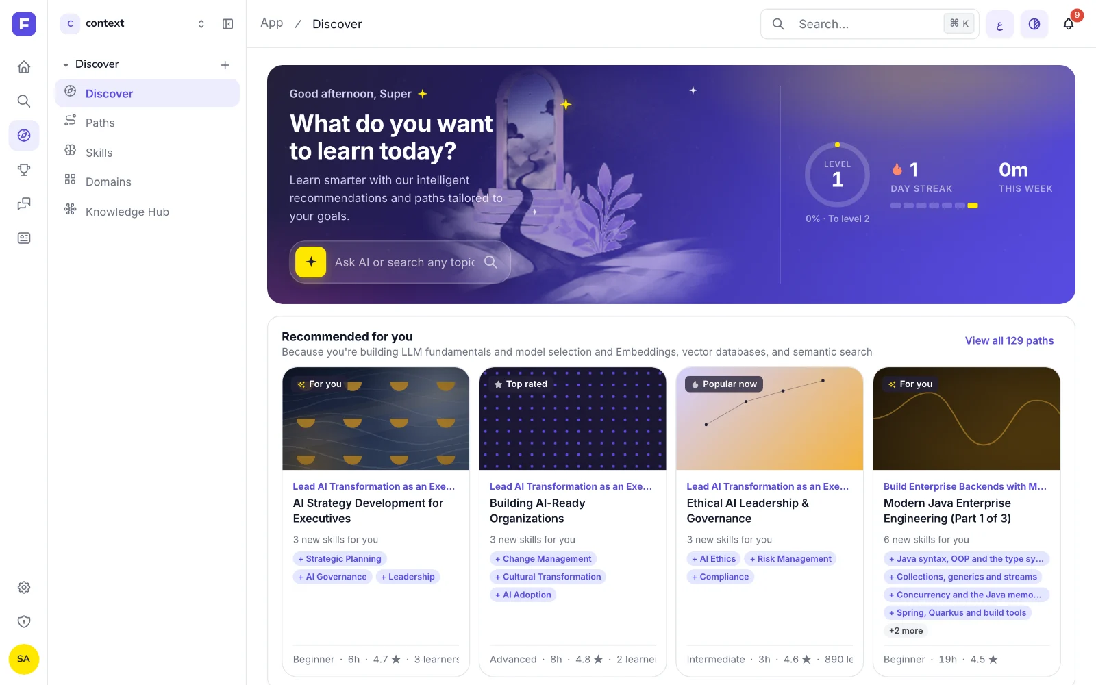
The redesigned Discover page moved onto /app/discover. It opens with a greeting, a search box and your week (streak, time and level), followed by recommendations and in-demand skills. In Arabic the hero gradient is mirrored.
Also in this release
Added
- A “Learner surfaces” group on the admin feature-flags page.
Changed
- Dragging on the Hub map dropped from about five React commits per frame to one.
Fixed
- Journal article text on fkra.ai had a contrast of about 1.5:1 because the page missed a stylesheet. It is now 11.36:1, and scrolling no longer re-renders the article.
- The chart editor’s code area stays left-to-right under the Arabic interface.
Removed
- /app/discover/v2, merged into /app/discover.
One email when we publish. Research, product decisions, and what teams report back.